
A question I’ve been getting a lot lately is, “What is your favorite color white paint.”
Honestly, a few months ago, I would have told you that it didn’t matter. That any white would do. But the more projects I’ve done and the more I’ve thought about every design decision, I’ve found that’s simply not true.
The right color white can make or break a space (okay not completely, no pressure). Each white paint color gives off a totally different vibe.
But how do you choose the right one?
Great question!
And let me back up, you actually can’t go wrong — whatever you decide is right for your space is right for your space!
But I’ve done a lot of digging and experimenting, and I’ve pulled together my top three white paint colors to help your project stand out and tell the right story.

3 WHITE PAINT COLORS THAT WILL HAVE YOU WONDERING WHY YOU’VE CHOSEN PURE WHITE ALL THESE YEARS
Anyone else become paralyzed as soon as they approach the paint swatch section at the local hardware store?
Just me?

Choosing a paint color is tough! Especially when you can’t see it in your space. There are so many options, and so many of them look so similar!
I start by pulling samples and viewing them side by side. You’d be amazing at how different they look when you compare them, which can help you rule out colors that are too cool, too warm, too dark, or too light.
Then I think about my project and what I want it to look like. Do I want it to look stark white and brand new? Aged or vintage? Timeless? How warm or how cool?
Think through exactly what you want and go from there!
And when in doubt, you can’t go wrong with these three white paint colors!
PAINT COLOR #1: CHANTILLY LACE

This color is by Benjamin Moore and is the definition of perfection. This is probably my favorite white paint color out there.
It’s soft, sweet, and subtle. It’s a little on the cooler side which I prefer, but it’s also nice and delicate and gives off a vintage white vibe.
It adds a layer of serenity to any room, especially when compared to a stark, pure white.
This timeless color is a no-brainer for any project!
PAINT COLOR #2: BIT OF SUGAR
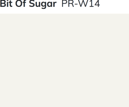
This Behr paint color is basically all the things I said about Chantilly Lace minus the cooler tones. It’s vintage, toned down, and pretty neutral, but it does warm up the white a little bit with its subtle gray tones.
This slightly off-white, aged color is perfect for projects like shiplap (what I most recently used it for) or other farmhouse features where you want something that looks both timeless and like it’s been there for a while.
Perfectly neutral!
PAINT COLOR #3: ALABASTER

This Sherwin Williams color is a little more creamy off-white than the other two lighter, brighter options, but it’s a great aged farmhouse color to warm up your walls while still being white!
As another timeless white with some depth, this warmer neutral could be used throughout your home and is a great wall color to replace a white, beige, or gray!
GET TO PAINTING!

Hopefully this short and sweet paint review will help you stop researching and start painting! Like I said, you really can’t go wrong when choosing the paint you want, but these three subtly scream timeless vintage farmhouse!
Which one is your favorite? Let me know in the comments!


Leave a Reply